ShopDreamUp AI ArtDreamUp
Deviation Actions


Suggested Deviants


Suggested Collections


You Might Like…


Featured in Groups


Description
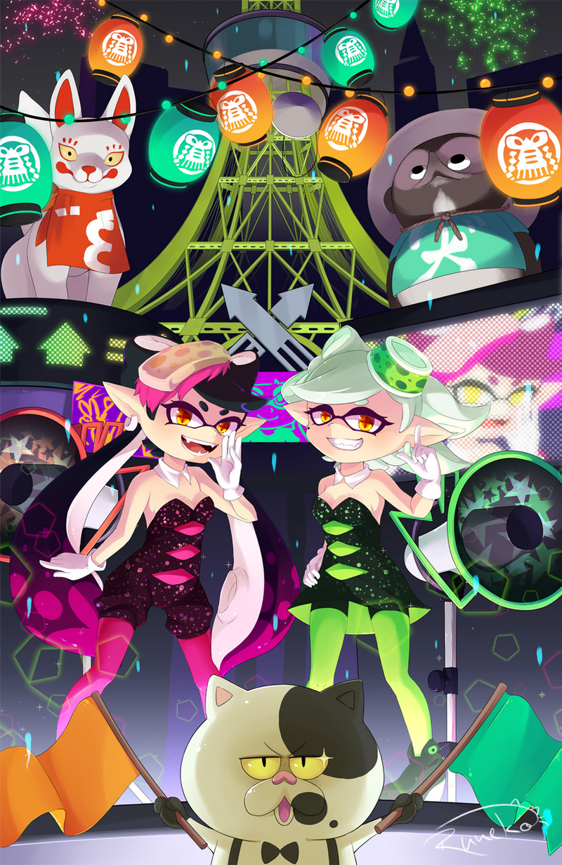
A thing I did for a Splatoon fanart contest held by Nintendo of Germany.
I spent almost 4 weeks working on it and I'm super proud to say it was worth it: I won! ;v;
The Splatfest is definitely my favourite part of Splatoon, not only is it fun as hell but I also love the whole make-up. The plaza being a mash up of various elements of Tokyo plus the traditional matsuri feel and all in the most colourful and contrasty way possible. AWESOME! ;v; Also I've been listening to Shiokarabushi nonstop while working on this... :'D
So it's only natural that I wanted to include as many elements of this festival in the picture as possible. On top of that I'm a huge fan of the Squid Sisters. I've already been wanting to draw them even before I heard about the contest, so this was the perfect opportunity. It was quite a challenge at the same time though. You don't want to know how many hours I spent only with adjusting their anatomy, especially their faces, until I was finally satisfied.
Yeah... in terms of details this piece has definitely gone beyond the scope... :') But I really needed to challenge myself with something again after such a long time. Really need to do this more often. <3
Art ©

I spent almost 4 weeks working on it and I'm super proud to say it was worth it: I won! ;v;
The Splatfest is definitely my favourite part of Splatoon, not only is it fun as hell but I also love the whole make-up. The plaza being a mash up of various elements of Tokyo plus the traditional matsuri feel and all in the most colourful and contrasty way possible. AWESOME! ;v; Also I've been listening to Shiokarabushi nonstop while working on this... :'D
So it's only natural that I wanted to include as many elements of this festival in the picture as possible. On top of that I'm a huge fan of the Squid Sisters. I've already been wanting to draw them even before I heard about the contest, so this was the perfect opportunity. It was quite a challenge at the same time though. You don't want to know how many hours I spent only with adjusting their anatomy, especially their faces, until I was finally satisfied.
Yeah... in terms of details this piece has definitely gone beyond the scope... :') But I really needed to challenge myself with something again after such a long time. Really need to do this more often. <3
Characters © Splatoon / Nintendo
Art © 
Image size
1000x1539px 1.75 MB
© 2015 - 2024 lunatic-neko
Comments15
Join the community to add your comment. Already a deviant? Log In
This is my first critique but I try ma best.
Overall Impression:
I like the atmosphere of the picture. It looks very casual and funny, which fits the game pretty well. It really seems like a colorful arena!
The fact, that there is so much to see, makes it really lively and a bit freaky <img src="e.deviantart.net/emoticons/b/b…" width="15" height="15" alt="
One thing, that's not so good, are the guidelines for the viewer. I look in th middle first, an there are those two arrows, that lead me up to the background and takes away the focus from the characters.
Anatomy:
Its an comic/chibi stile, so not near realistic. The lower legs of the girls are bend too much. I think the boobs of the pink girl look strange. They seem to be glued to the body. Those from the green girl are better. Other than that, those to look really cute and ready for some action.
Background:
I like it. It fits, it's detailed. I think the lights could glow a little stronger, like the fireworks, but that a small thing.
Color:
It looks good overall. The colors used assort well with each other. You often use sharp shadows. They fit the metal of the tower, but I think they don't look good for the skin of the girls. It looks a bit like plastic. The shadow stile of the cat in the front would be better for the skin. There's a bit blur to see^^
Other things:
I love the cat in the front. It looks super cute! Especially with the star in its eye.
I hope it helps you^^